Rubato Text
Type@Cooper Extended Program 2022
Student Work
Student Work


How might a traditional translation text typeface be made to feel friendly and accessible without sacrificing its elegance? Designed for use in the Cincinnati Symphony Orchestra’s brand identity, Rubato is a hearty text face that aims to maintain a balance between utility and congeniality.
With letterforms characterized by a broad-nib construction, Rubato is built according to the rules of longstanding traditions. The construction takes some liberties (such as a handful of swash terminals that introduce the softer texture of musical notes) in order to introduce a sense of warmth into the voice of the typeface, countering the sharp formality that is often associated with calligraphic models of construction.
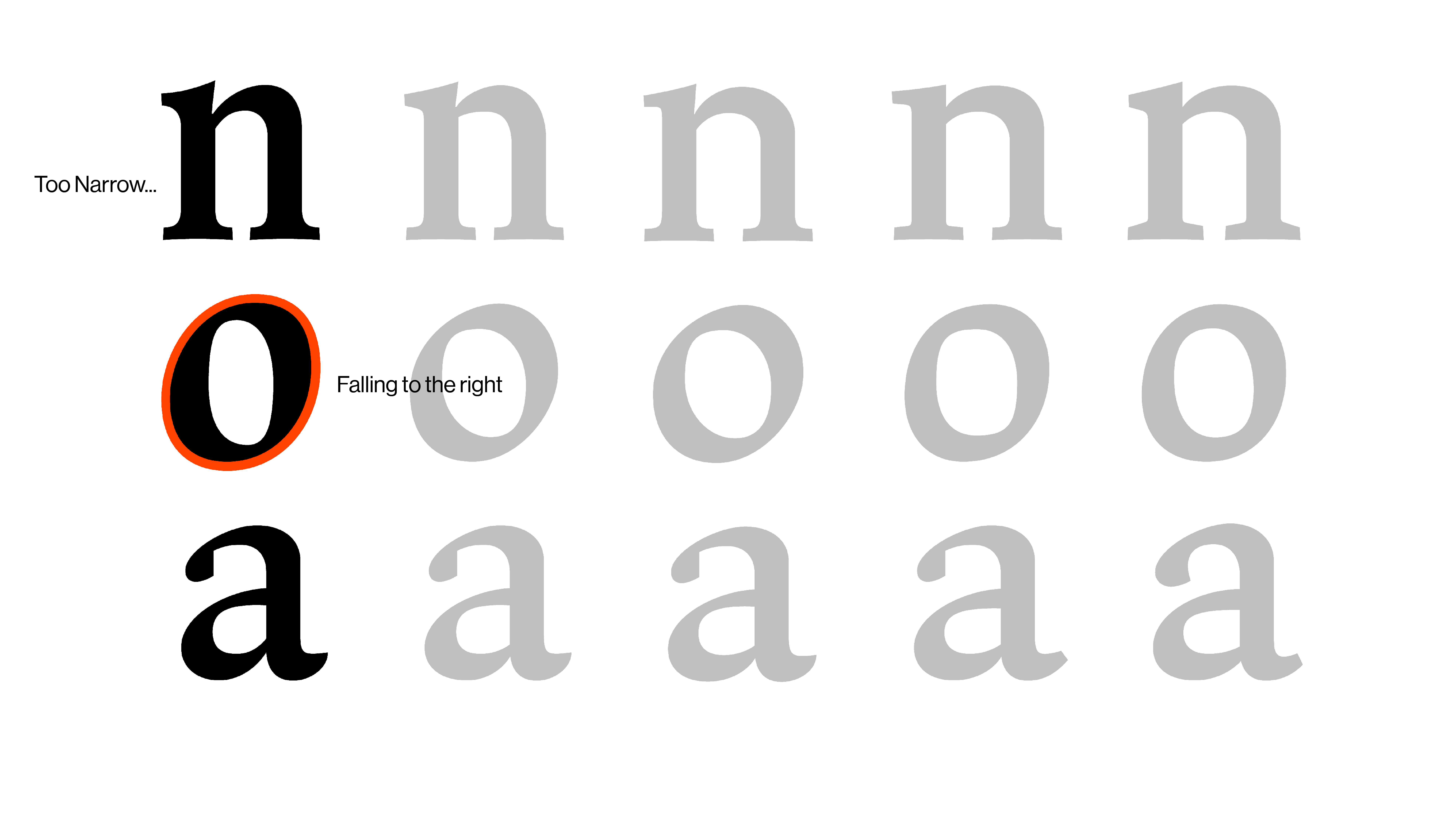
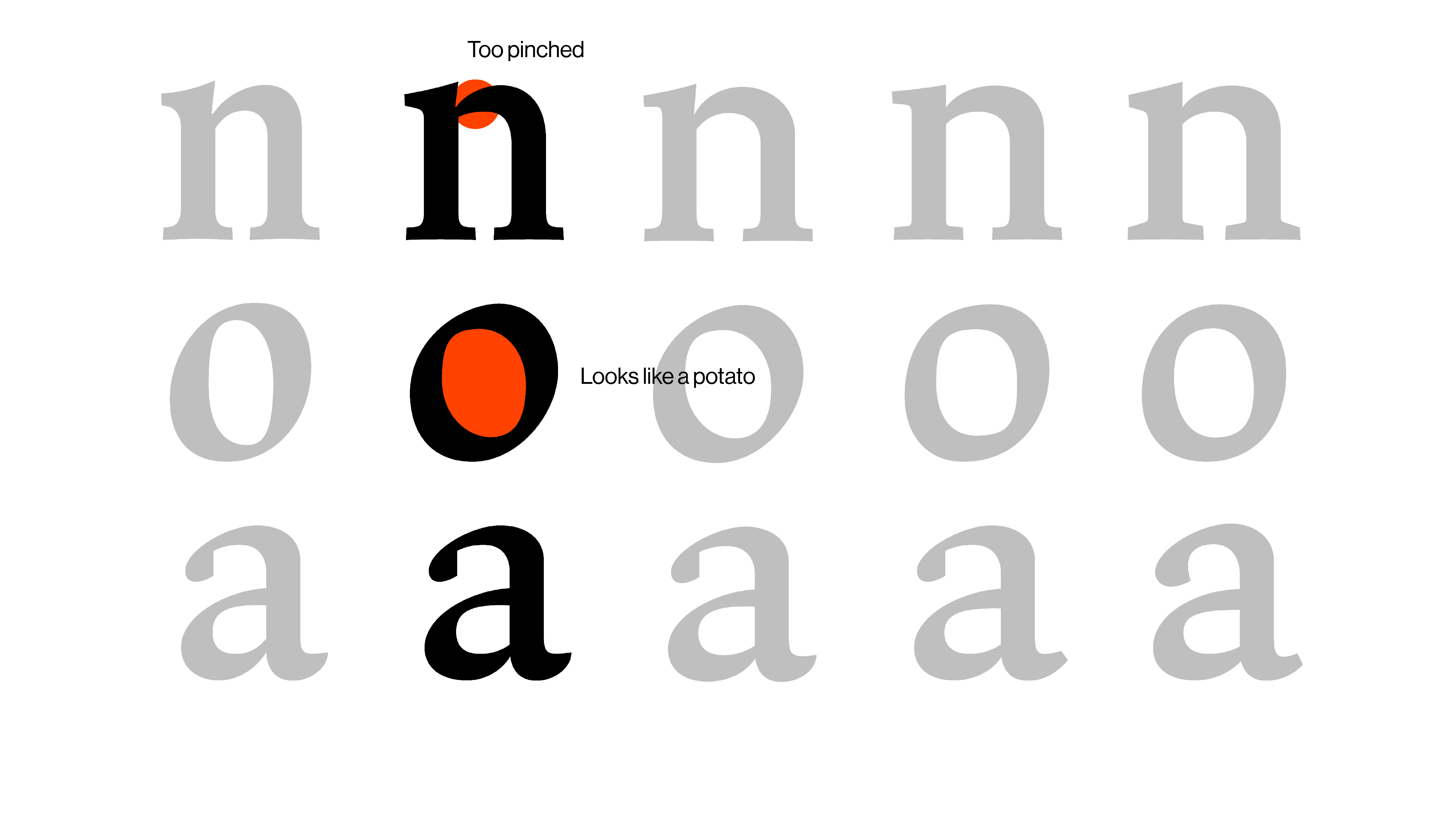
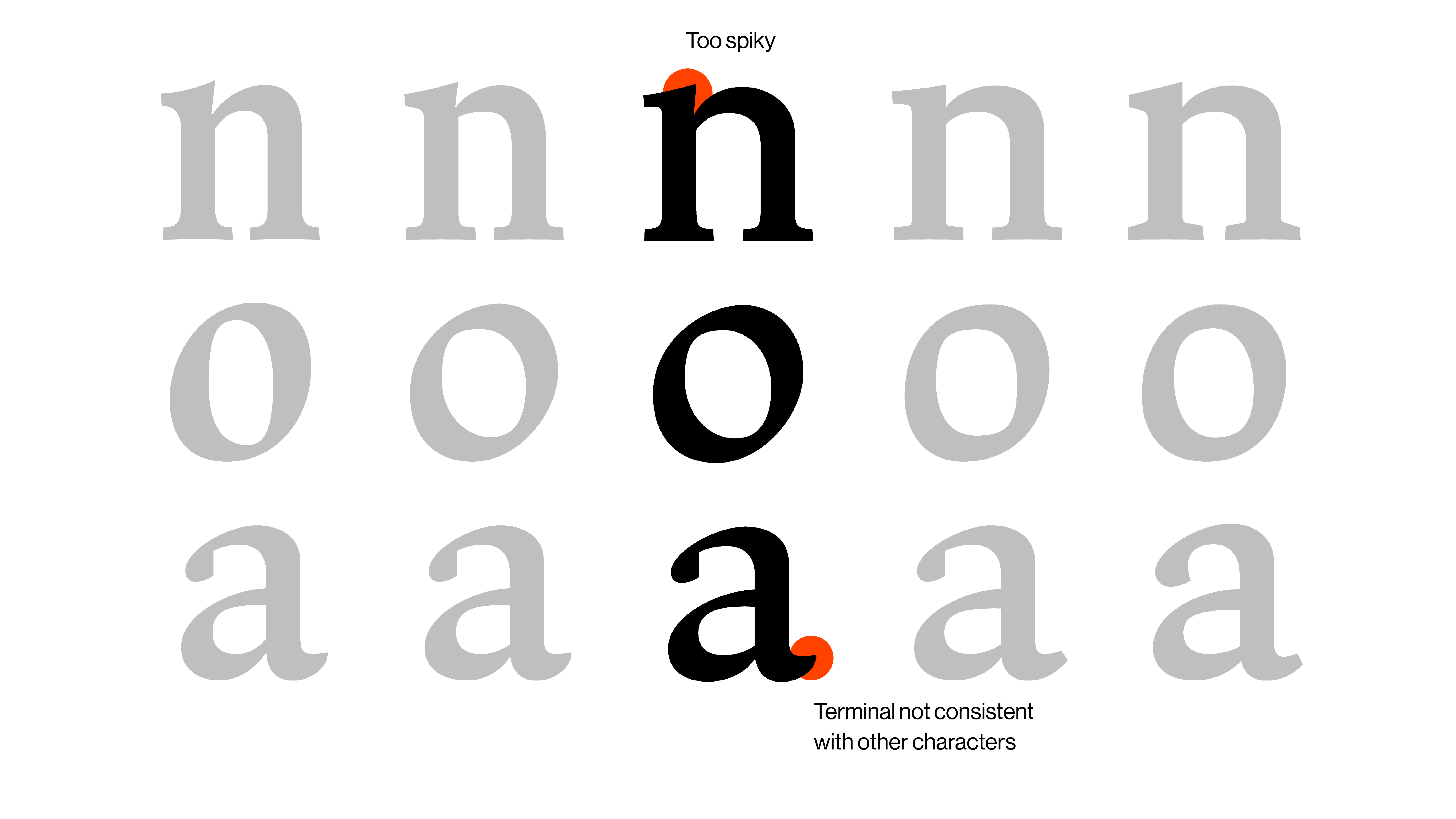
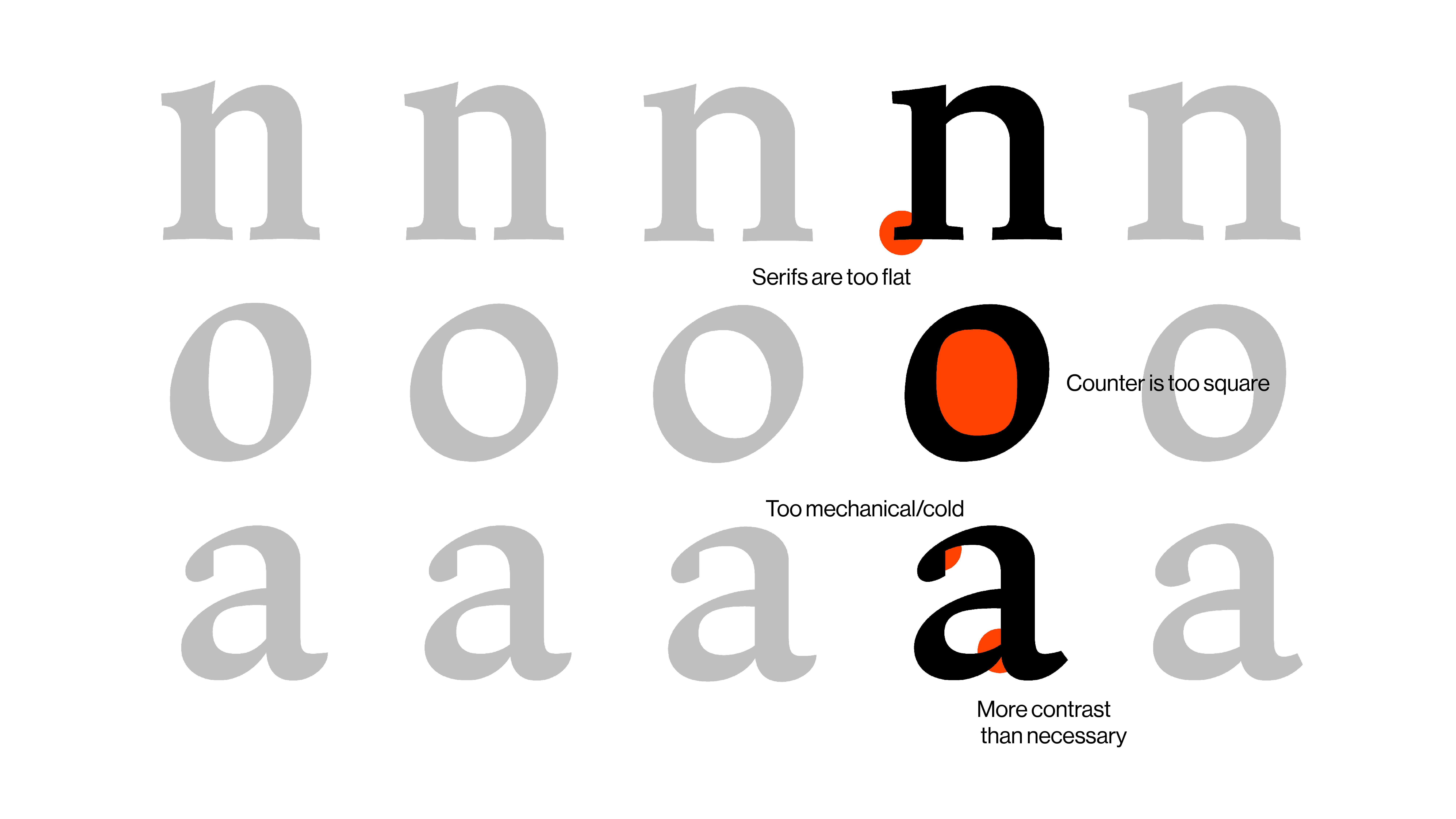
The first step of the process was calligraphy practice... lots of it. I explored different styles and proportions to figure out what aesthetic approach would best serve the initial project brief and give the letters the right character.


Rubato’s character set includes language support for all central European languages, complete punctuation, math and currency symbols!
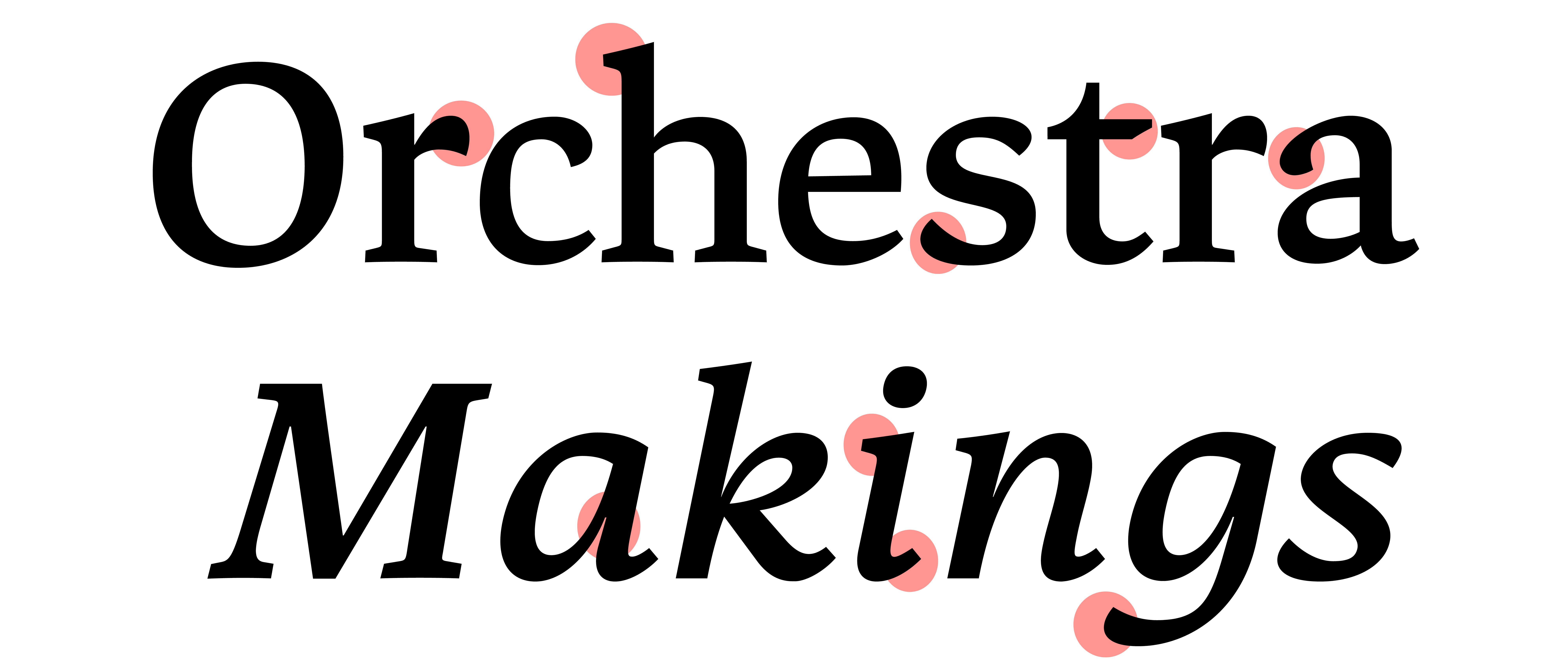
Both the Roman and italic styles share the same DNA: thick wedge serifs that read at small sizes, a number of swash terminals, and a consistent basis in broad nib calligraphy.

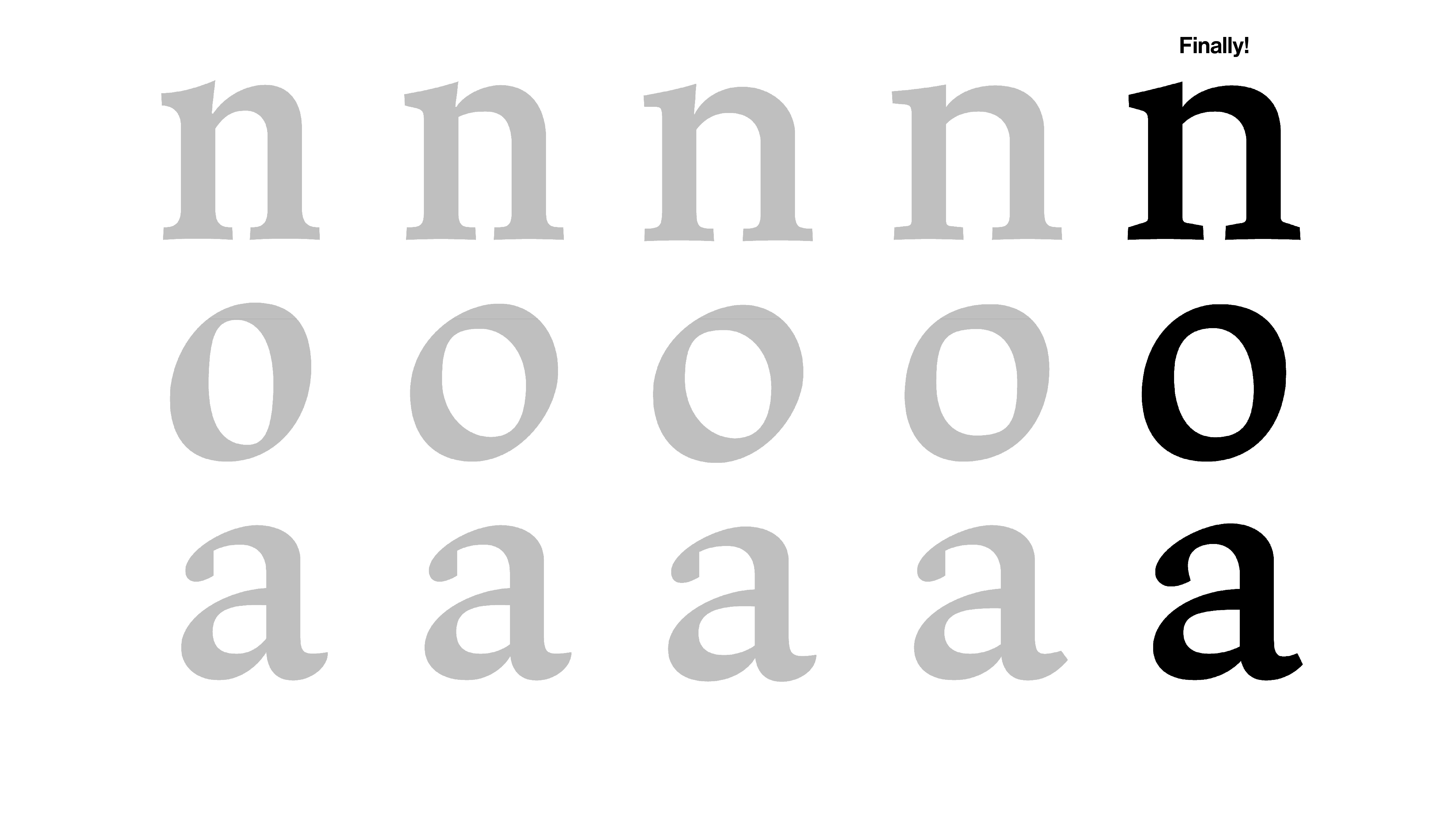
Rubato includes three weights useful in text: regular, medium and bold. All weights share the same backbone, and their differences account for changes in our perception at small optical sizes. For example, the bold weight has a higher x-height than the regular, because we percieve bolder text as shorter and wider when it is paired with lighter weights.