Saint Francis Apizza
Client Work
2021
2021
In February 2021, I created a logo and signage for Saint Francis Apizza, a restaurant in Cincinnati's Hyde Park neighborhood. The business is all about quality, whether it's their commitment to using locally sourced ingredients, customer service, or community engagement.
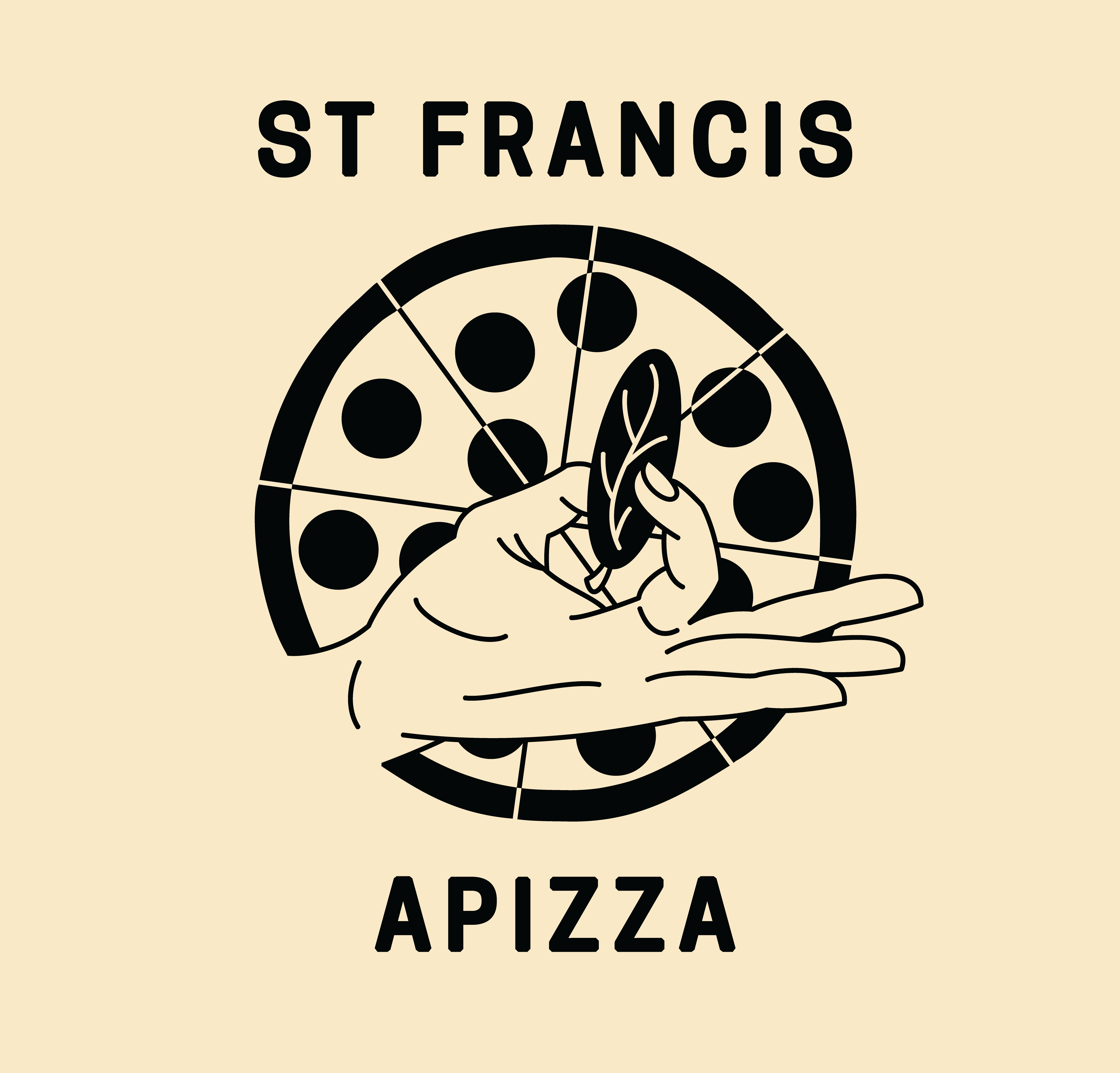
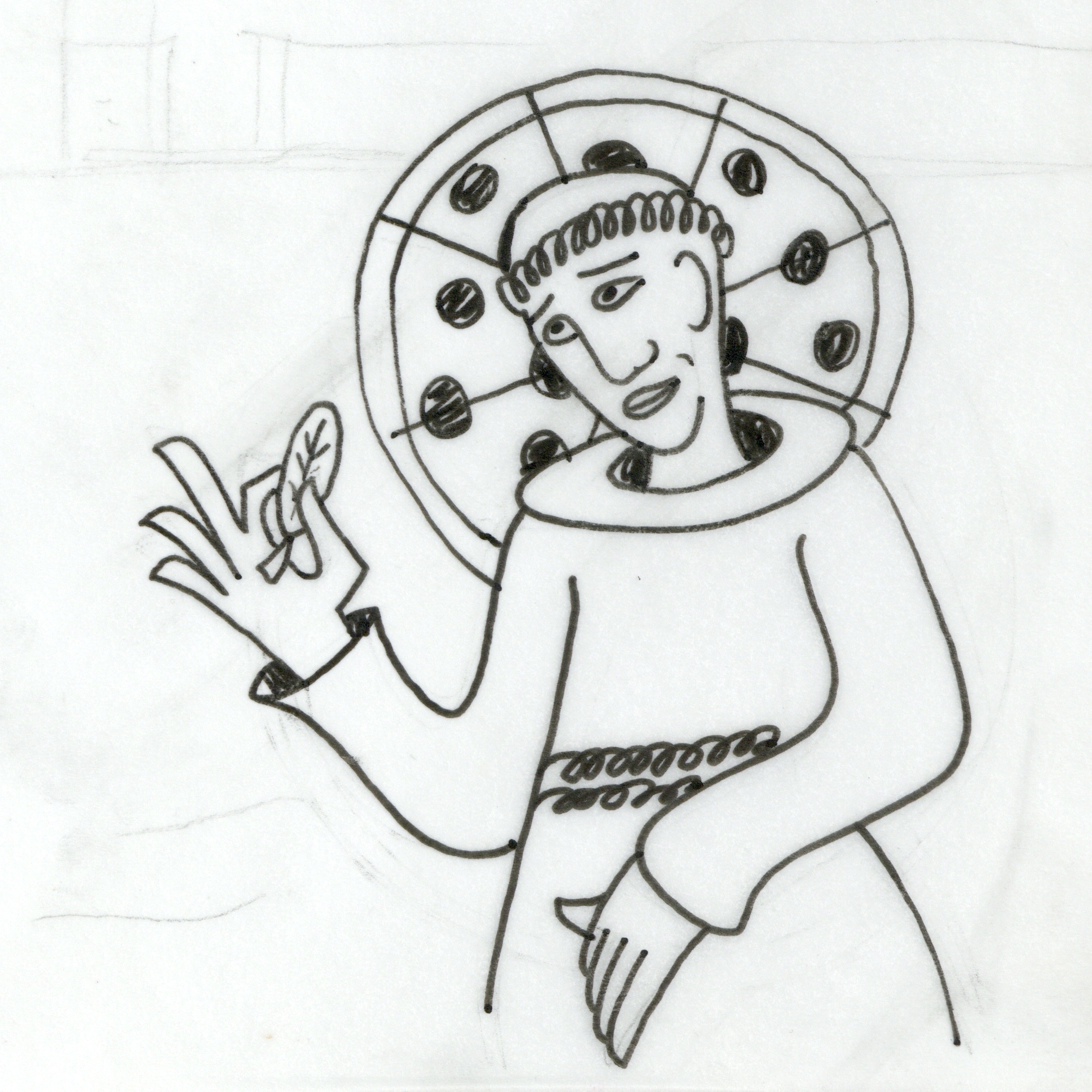
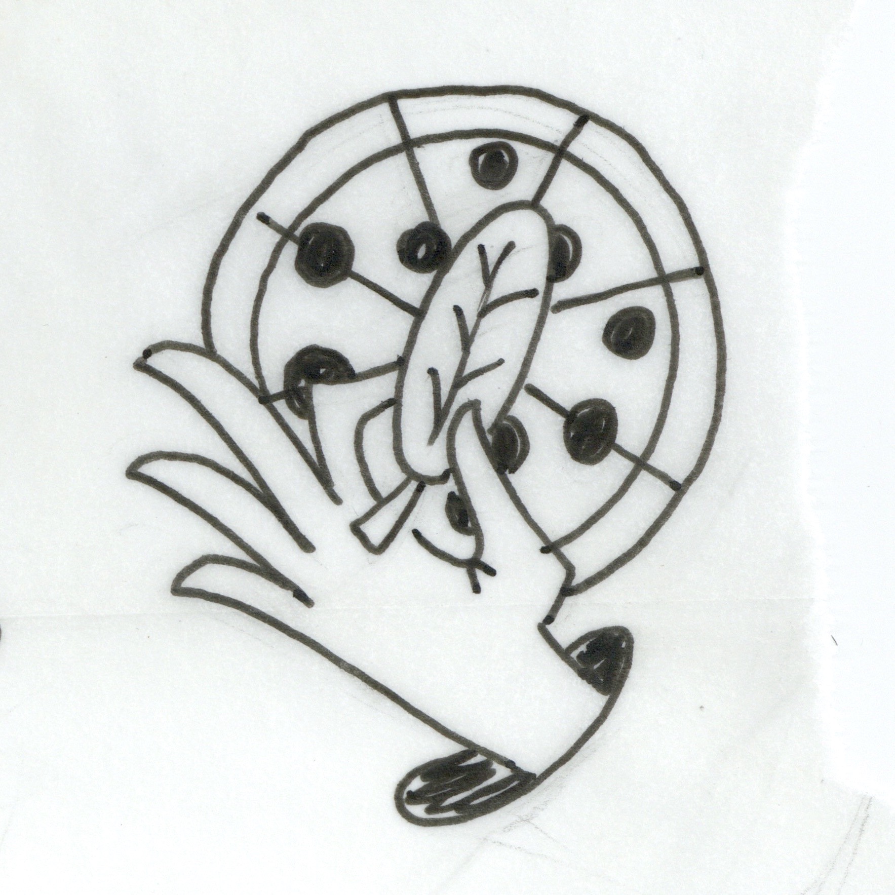
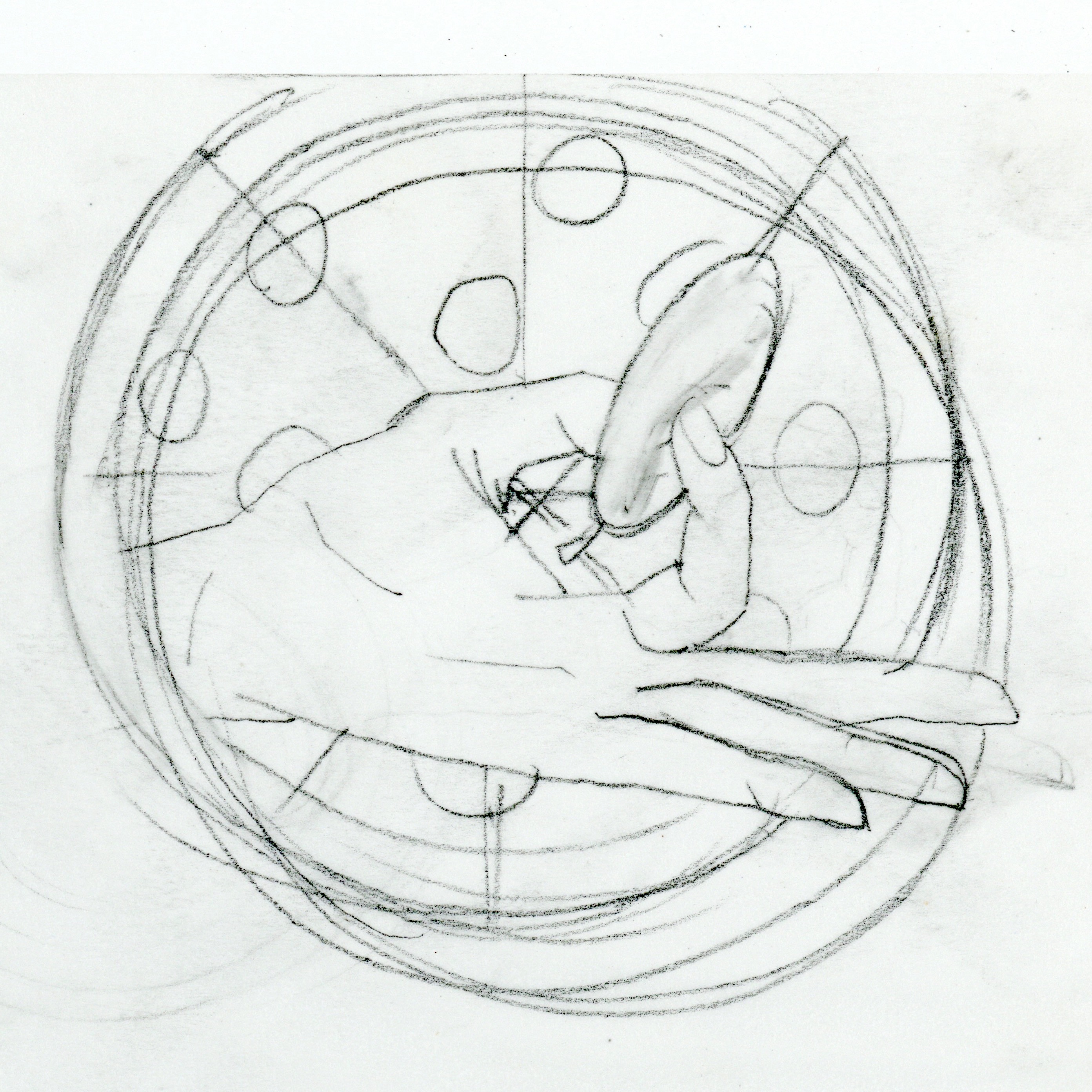
The logo for the brand emphasizes St Francis Apizza's standard of perfection, by including the transcultural hand gesture for "just right." Since basil leaves come with all the pies as side toppings, and are a cornerstone of the St Francis flavor, it seemed appropriate to incorporate in the logo.
The job called for two versions of the logo: one legible at large sizes (that could be painted on the wall of the site or printed on pizza boxes), and one that could be read at small sizes (to be used as an Instagram icon or on gift cards).
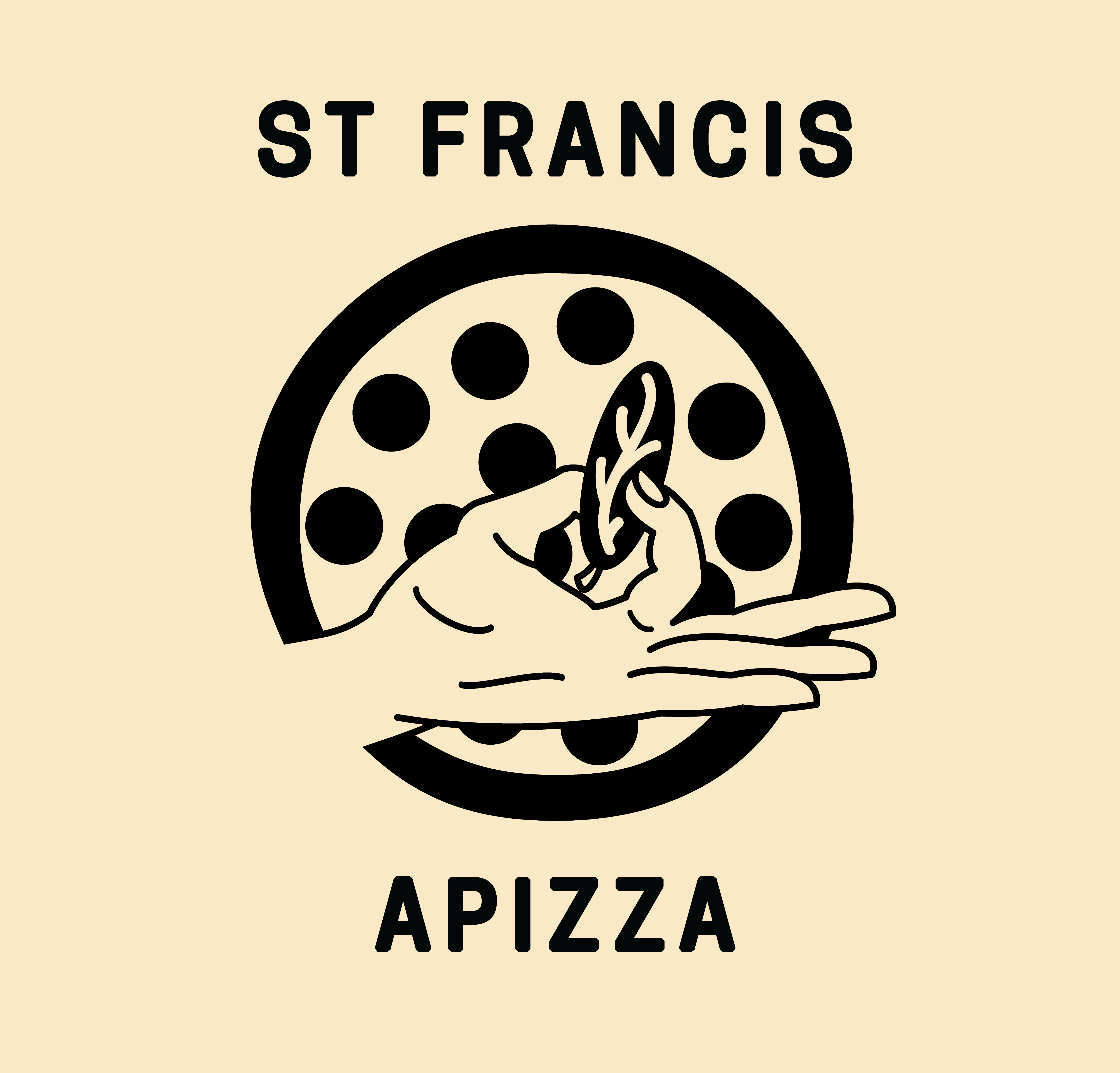

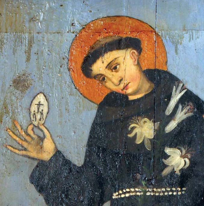
The initial inspiration came when researching artistic iconography surrounding Saint Francis of Assisi, who the business was in part named after. The compositional simplicity of a painting by an unknown artist resonated with me.
The aesthetic approach needed to be simplified, and not based solely on a historical work of art. Multiple rounds of iterations were made, and we ultimately decided to focus in on the quality and flavor of the brand as opposed to the backstory.
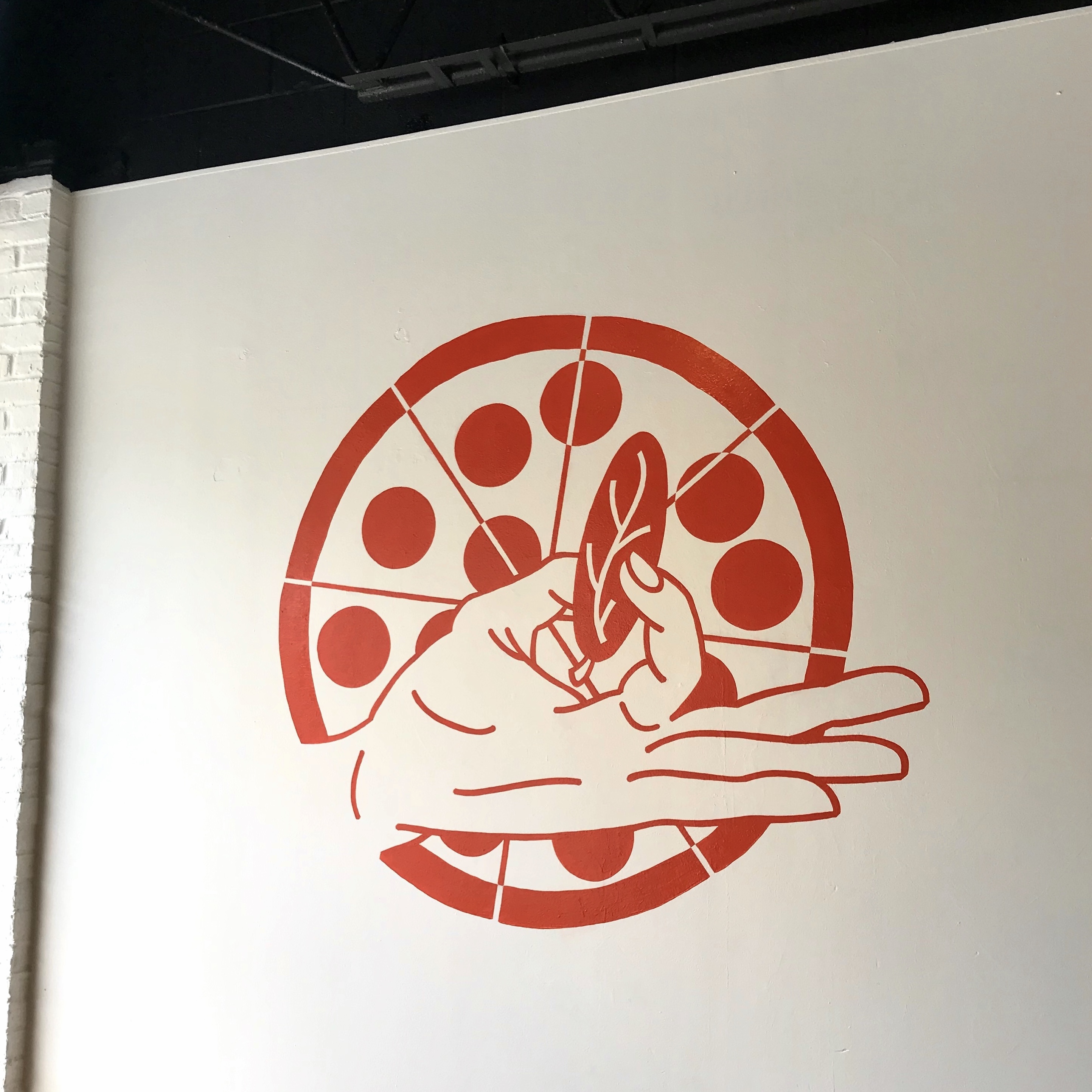
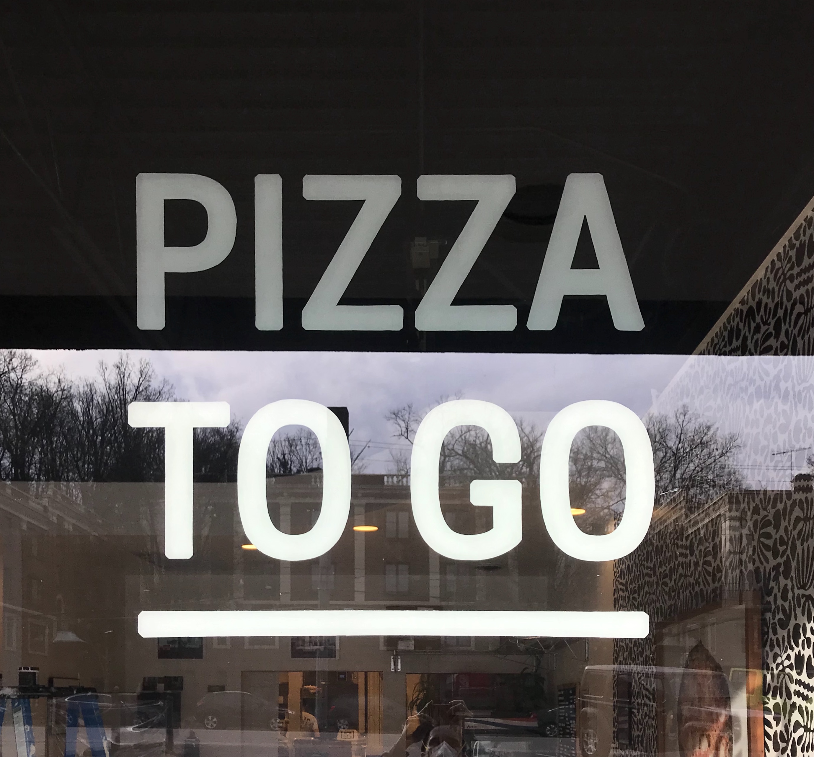
All of the signage was hand painted for the storefront, emphasizing the focus on craft and independent nature of Saint Francis Apizza.
The aesthetic approach needed to be simplified, and not based solely on a historical work of art. Multiple rounds of iterations were made, and we ultimately decided to focus in on the quality and flavor of the brand as opposed to the backstory.
All of the signage was hand painted for the storefront, emphasizing the focus on craft and independent nature of Saint Francis Apizza.


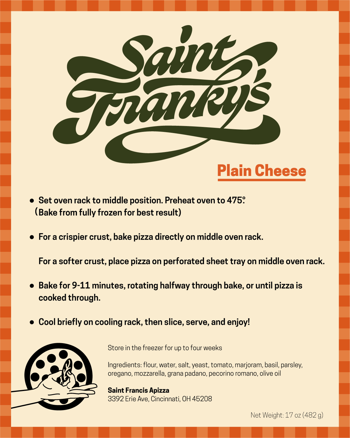
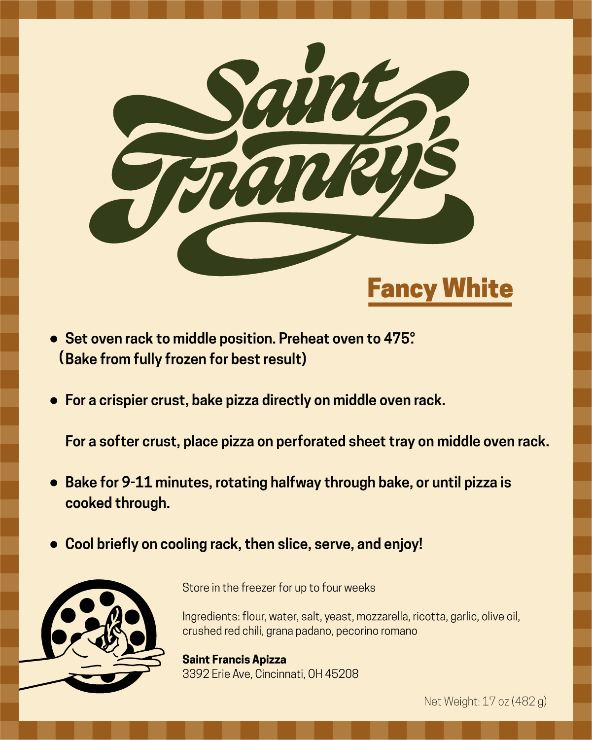
The shop sells bake-at-home pies as well, with three different toppings. The colors on the label distinguish the unique flavors of each pie.